Titanic Case Study Project Analysis
 |
|---|
| Photo credit: sokada.co.uk |
This project was divided into 3 parts:
Part 1: Graphics Analysis
Part 2: Feature Reduction & Filling in Missing Values
Part 3: Split Train Test & Model Selection and Evaluation
Objective
The objective of this project was to get familiar with how a case study work and learning to perform data analysis from start to finish as well as creating a predictive model through training and testing the models. The model that I chose for this case study was logistic regression.
Titanic Tutorial Part 1:
Graph Analysis
import warnings
warnings.filterwarnings("ignore")
import pandas as pd
import matplotlib.pyplot as plt
import yellowbrick
from yellowbrick.features import Rank2D
from yellowbrick.features import ParallelCoordinates
from yellowbrick.style import set_palette

%matplotlib inline
Step 1: Load data into dataframe
addr1 = "data/train.csv"
data = pd.read_csv(addr1)
Step 2: check the dimension of the table
print("The dimension of the table is: ", data.shape)
The dimension of the table is: (891, 12)
Step 3: Look at the data
print(data.head(5))
   PassengerId  Survived  Pclass  \
0            1         0       3
1            2         1       1
2            3         1       3
3            4         1       1
4            5         0       3

                                                Name     Sex   Age  SibSp  \
0                            Braund, Mr. Owen Harris    male  22.0      1
1  Cumings, Mrs. John Bradley (Florence Briggs Th...  female  38.0      1
2                             Heikkinen, Miss. Laina  female  26.0      0
3       Futrelle, Mrs. Jacques Heath (Lily May Peel)  female  35.0      1
4                           Allen, Mr. William Henry    male  35.0      0

   Parch            Ticket     Fare Cabin Embarked
0      0         A/5 21171   7.2500   NaN        S
1      0          PC 17599  71.2833   C85        C
2      0  STON/O2. 3101282   7.9250   NaN        S
3      0            113803  53.1000  C123        S
4      0            373450   8.0500   NaN        S
data.info()
<class 'pandas.core.frame.DataFrame'>
RangeIndex: 891 entries, 0 to 890
Data columns (total 12 columns):
PassengerId    891 non-null int64
Survived       891 non-null int64
Pclass         891 non-null int64
Name           891 non-null object
Sex            891 non-null object
Age            714 non-null float64
SibSp          891 non-null int64
Parch          891 non-null int64
Ticket         891 non-null object
Fare           891 non-null float64
Cabin          204 non-null object
Embarked       889 non-null object
dtypes: float64(2), int64(5), object(5)
memory usage: 83.7+ KB
import statsmodels.formula.api as smf
results = smf.ols('Age ~ Fare + SibSp + Parch', data=data).fit()
print(results.summary())
                            OLS Regression Results
==============================================================================
Dep. Variable:                    Age   R-squared:                       0.125
Model:                            OLS   Adj. R-squared:                  0.121
Method:                 Least Squares   F-statistic:                     33.78
Date:                Wed, 22 Jan 2020   Prob (F-statistic):           2.04e-20
Time:                        13:45:24   Log-Likelihood:                -2875.6
No. Observations:                 714   AIC:                             5759.
Df Residuals:                     710   BIC:                             5778.
Df Model:                           3
Covariance Type:            nonrobust
==============================================================================
                 coef    std err          t      P>|t|      [0.025      0.975]
------------------------------------------------------------------------------
Intercept     31.3078      0.664     47.153      0.000      30.004      32.611
Fare           0.0436      0.010      4.414      0.000       0.024       0.063
SibSp         -4.4912      0.595     -7.545      0.000      -5.660      -3.322
Parch         -1.8953      0.656     -2.888      0.004      -3.184      -0.607
==============================================================================
Omnibus:                       34.675   Durbin-Watson:                   1.915
Prob(Omnibus):                  0.000   Jarque-Bera (JB):               38.670
Skew:                           0.568   Prob(JB):                     4.01e-09
Kurtosis:                       3.105   Cond. No.                         91.3
==============================================================================

Warnings:
[1] Standard Errors assume that the covariance matrix of the errors is correctly specified.
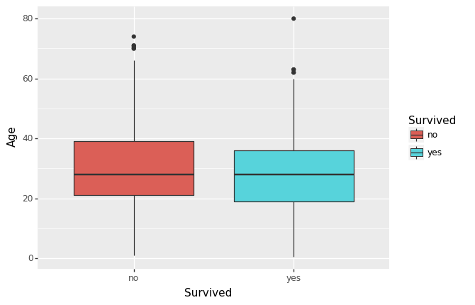
from plotnine import *
df = data.copy()
df = df.replace({'Survived': {1: 'yes', 0: 'no'}})
(ggplot(df, aes(x='Survived', y='Age', fill='Survived')) +
        geom_boxplot()
)
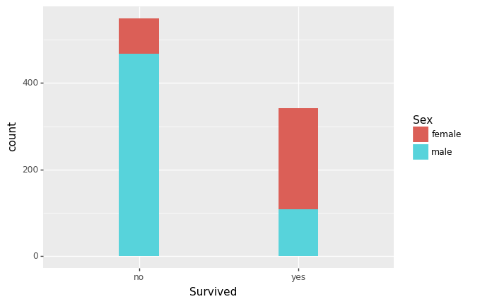
(ggplot(df, aes(x='Survived', fill='Sex')) +
        geom_histogram()
)
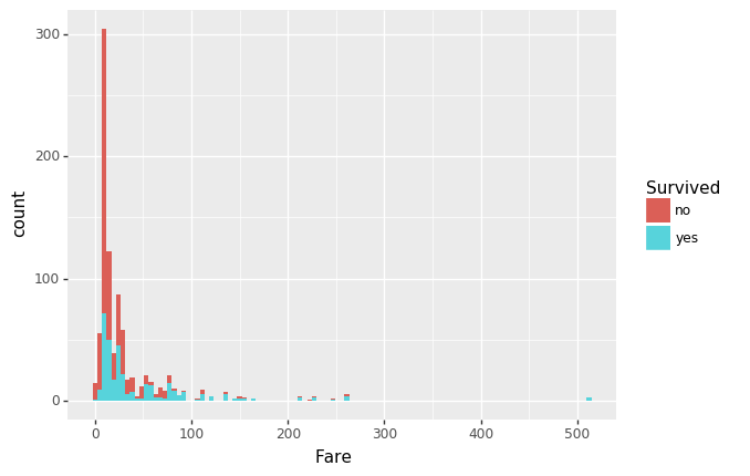
(ggplot(df, aes(x='Fare', fill='Survived')) +
        geom_histogram()
)
Step 4: Think about some questions that might help you predict who will survive:
-
What do the variables look like? For example, are they numerical or categorical data. If they are numerical, what are their distribution; if they are categorical, how many are they in different categories?
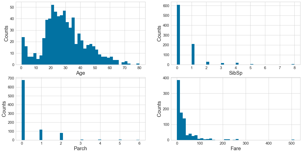
There is a mix of categorical (Survived, Pclass, Sex, Embarked) and numerical (Fare, Age, SibSp, Parch). Of the numerical variables, Age is normally distributed although somewhat right-skewed. The other numerical variables are heavily skewed with long right tails, tapering off very quickly. -
Are the numerical variables correlated?
Running an ordinary linear model, there does not appear to be justification for correlation (R squared is close to 0, indicating neither positive or negative correlation). Further, the meaning of the variables also do not explain away any justification for correlation. -
Are the distributions of numerical variables the same or different among survived and not survived? Is the survival rate different for different values? For example, were people more likely to survive if they were younger?
I plotted Age against Survival above, and there does appear to be a slightly younger group who did survive (and might be more pronounced if the data poinst above say, age 60, were removed). -
Are there different survival rates in different categories? For example, did more women survived than man?
Yes, as shown in the bar graph above, more women did survive. It’s also evident that those who paid the lowest fares did not… “fare” well….
Step 5: what type of variables are in the table
print("Describe Data")
print(data.describe())
print("Summarized Data")
print(data.describe(include=['O']))
Describe Data
       PassengerId    Survived      Pclass         Age       SibSp  \
count   891.000000  891.000000  891.000000  714.000000  891.000000
mean    446.000000    0.383838    2.308642   29.699118    0.523008
std     257.353842    0.486592    0.836071   14.526497    1.102743
min       1.000000    0.000000    1.000000    0.420000    0.000000
25%     223.500000    0.000000    2.000000   20.125000    0.000000
50%     446.000000    0.000000    3.000000   28.000000    0.000000
75%     668.500000    1.000000    3.000000   38.000000    1.000000
max     891.000000    1.000000    3.000000   80.000000    8.000000

            Parch        Fare
count  891.000000  891.000000
mean     0.381594   32.204208
std      0.806057   49.693429
min      0.000000    0.000000
25%      0.000000    7.910400
50%      0.000000   14.454200
75%      0.000000   31.000000
max      6.000000  512.329200
Summarized Data
                   Name   Sex    Ticket        Cabin Embarked
count               891   891       891          204      889
unique              891     2       681          147        3
top     Rekic, Mr. Tido  male  CA. 2343  C23 C25 C27        S
freq                  1   577         7            4      644
Step 6: import visualization packages
# set up the figure size
plt.rcParams['figure.figsize'] = (20, 10)

# make subplots
fig, axes = plt.subplots(nrows = 2, ncols = 2)

# Specify the features of interest
num_features = ['Age', 'SibSp', 'Parch', 'Fare']
xaxes = num_features
yaxes = ['Counts', 'Counts', 'Counts', 'Counts']

# draw histograms
axes = axes.ravel()
for idx, ax in enumerate(axes):
    ax.hist(data[num_features[idx]].dropna(), bins=40)
    ax.set_xlabel(xaxes[idx], fontsize=20)
    ax.set_ylabel(yaxes[idx], fontsize=20)
    ax.tick_params(axis='both', labelsize=15)
plt.show()
7: Barcharts: set up the figure size
plt.rcParams['figure.figsize'] = (20, 10)

# make subplots
fig, axes = plt.subplots(nrows = 2, ncols = 2)

# make the data read to feed into the visualizer
X_Survived = data.replace({'Survived': {1: 'yes', 0: 'no'}}).groupby('Survived').size().reset_index(name='Counts')['Survived']
Y_Survived = data.replace({'Survived': {1: 'yes', 0: 'no'}}).groupby('Survived').size().reset_index(name='Counts')['Counts']
# make the bar plot
axes[0, 0].bar(X_Survived, Y_Survived)
axes[0, 0].set_title('Survived', fontsize=25)
axes[0, 0].set_ylabel('Counts', fontsize=20)
axes[0, 0].tick_params(axis='both', labelsize=15)

# make the data read to feed into the visualizer
X_Pclass = data.replace({'Pclass': {1: '1st', 2: '2nd', 3: '3rd'}}).groupby('Pclass').size().reset_index(name='Counts')['Pclass']
Y_Pclass = data.replace({'Pclass': {1: '1st', 2: '2nd', 3: '3rd'}}).groupby('Pclass').size().reset_index(name='Counts')['Counts']
# make the bar plot
axes[0, 1].bar(X_Pclass, Y_Pclass)
axes[0, 1].set_title('Pclass', fontsize=25)
axes[0, 1].set_ylabel('Counts', fontsize=20)
axes[0, 1].tick_params(axis='both', labelsize=15)

# make the data read to feed into the visualizer
X_Sex = data.groupby('Sex').size().reset_index(name='Counts')['Sex']
Y_Sex = data.groupby('Sex').size().reset_index(name='Counts')['Counts']
# make the bar plot
axes[1, 0].bar(X_Sex, Y_Sex)
axes[1, 0].set_title('Sex', fontsize=25)
axes[1, 0].set_ylabel('Counts', fontsize=20)
axes[1, 0].tick_params(axis='both', labelsize=15)

# make the data read to feed into the visualizer
X_Embarked = data.groupby('Embarked').size().reset_index(name='Counts')['Embarked']
Y_Embarked = data.groupby('Embarked').size().reset_index(name='Counts')['Counts']
# make the bar plot
axes[1, 1].bar(X_Embarked, Y_Embarked)
axes[1, 1].set_title('Embarked', fontsize=25)
axes[1, 1].set_ylabel('Counts', fontsize=20)
axes[1, 1].tick_params(axis='both', labelsize=15)
plt.show()
Step 8: Pearson Ranking
#set up the figure size
plt.rcParams['figure.figsize'] = (15, 7)

# extract the numpy arrays from the data frame
X = data[num_features].as_matrix()

# instantiate the visualizer with the Covariance ranking algorithm
visualizer = Rank2D(features=num_features, algorithm='pearson')
visualizer.fit(X)                # Fit the data to the visualizer
visualizer.transform(X)             # Transform the data
visualizer.poof(outpath="pcoords1.png") # Draw/show/poof the data
plt.show()
Step 9: Compare variables against Survived and Not Survived
#set up the figure size
plt.rcParams['figure.figsize'] = (15, 7)
plt.rcParams['font.size'] = 50

# setup the color for yellowbrick visualizer
set_palette('sns_bright')

# Specify the features of interest and the classes of the target
classes = ['Not-survived', 'Survived']
num_features = ['Age', 'SibSp', 'Parch', 'Fare']

# copy data to a new dataframe
data_norm = data.copy()
# normalize data to 0-1 range
for feature in num_features:
    data_norm[feature] = (data[feature] - data[feature].mean(skipna=True)) / (data[feature].max(skipna=True) - data[feature].min(skipna=True))

# Extract the numpy arrays from the data frame
X = data_norm[num_features].as_matrix()
y = data.Survived.as_matrix()

# Instantiate the visualizer
visualizer = ParallelCoordinates(classes=classes, features=num_features)

visualizer.fit(X, y)      # Fit the data to the visualizer
visualizer.transform(X)   # Transform the data
#visualizer.poof(outpath="d://pcoords2.png") # Draw/show/poof the data
plt.show()
Step 10 - stacked bar charts to compare survived/not survived
#set up the figure size
plt.rcParams['figure.figsize'] = (20, 10)

# make subplots
fig, axes = plt.subplots(nrows = 2, ncols = 2)

# make the data read to feed into the visualizer
Sex_survived = data.replace({'Survived': {1: 'Survived', 0: 'Not-survived'}})[data['Survived']==1]['Sex'].value_counts()
Sex_not_survived = data.replace({'Survived': {1: 'Survived', 0: 'Not-survived'}})[data['Survived']==0]['Sex'].value_counts()
Sex_not_survived = Sex_not_survived.reindex(index = Sex_survived.index)
# make the bar plot
p1 = axes[0, 0].bar(Sex_survived.index, Sex_survived.values)
p2 = axes[0, 0].bar(Sex_not_survived.index, Sex_not_survived.values, bottom=Sex_survived.values)
axes[0, 0].set_title('Sex', fontsize=25)
axes[0, 0].set_ylabel('Counts', fontsize=20)
axes[0, 0].tick_params(axis='both', labelsize=15)
axes[0, 0].legend((p1[0], p2[0]), ('Survived', 'Not-survived'), fontsize = 15)

# make the data read to feed into the visualizer
Pclass_survived = data.replace({'Survived': {1: 'Survived', 0: 'Not-survived'}}).replace({'Pclass': {1: '1st', 2: '2nd', 3: '3rd'}})[data['Survived']==1]['Pclass'].value_counts()
Pclass_not_survived = data.replace({'Survived': {1: 'Survived', 0: 'Not-survived'}}).replace({'Pclass': {1: '1st', 2: '2nd', 3: '3rd'}})[data['Survived']==0]['Pclass'].value_counts()
Pclass_not_survived = Pclass_not_survived.reindex(index = Pclass_survived.index)
# make the bar plot
p3 = axes[0, 1].bar(Pclass_survived.index, Pclass_survived.values)
p4 = axes[0, 1].bar(Pclass_not_survived.index, Pclass_not_survived.values, bottom=Pclass_survived.values)
axes[0, 1].set_title('Pclass', fontsize=25)
axes[0, 1].set_ylabel('Counts', fontsize=20)
axes[0, 1].tick_params(axis='both', labelsize=15)
axes[0, 1].legend((p3[0], p4[0]), ('Survived', 'Not-survived'), fontsize = 15)

# make the data read to feed into the visualizer
Embarked_survived = data.replace({'Survived': {1: 'Survived', 0: 'Not-survived'}})[data['Survived']==1]['Embarked'].value_counts()
Embarked_not_survived = data.replace({'Survived': {1: 'Survived', 0: 'Not-survived'}})[data['Survived']==0]['Embarked'].value_counts()
Embarked_not_survived = Embarked_not_survived.reindex(index = Embarked_survived.index)
# make the bar plot
p5 = axes[1, 0].bar(Embarked_survived.index, Embarked_survived.values)
p6 = axes[1, 0].bar(Embarked_not_survived.index, Embarked_not_survived.values, bottom=Embarked_survived.values)
axes[1, 0].set_title('Embarked', fontsize=25)
axes[1, 0].set_ylabel('Counts', fontsize=20)
axes[1, 0].tick_params(axis='both', labelsize=15)
axes[1, 0].legend((p5[0], p6[0]), ('Survived', 'Not-survived'), fontsize = 15)
plt.show()
Step 11 - fill in missing values and eliminate features
# fill with the most represented value
def fill_na_most(data, inplace=True):
    return data.fillna('S', inplace=inplace)

fill_na_most(data['Embarked'])

# check the result
print(data['Embarked'].describe())
count     891
unique      3
top         S
freq      646
Name: Embarked, dtype: object
# import package
import numpy as np

# log-transformation
def log_transformation(data):
    return data.apply(np.log1p)

data['Fare_log1p'] = log_transformation(data['Fare'])

# check the data
print(data.describe())
       PassengerId    Survived      Pclass         Age       SibSp  \
count   891.000000  891.000000  891.000000  891.000000  891.000000
mean    446.000000    0.383838    2.308642   29.361582    0.523008
std     257.353842    0.486592    0.836071   13.019697    1.102743
min       1.000000    0.000000    1.000000    0.420000    0.000000
25%     223.500000    0.000000    2.000000   22.000000    0.000000
50%     446.000000    0.000000    3.000000   28.000000    0.000000
75%     668.500000    1.000000    3.000000   35.000000    1.000000
max     891.000000    1.000000    3.000000   80.000000    8.000000

            Parch        Fare  Fare_log1p
count  891.000000  891.000000  891.000000
mean     0.381594   32.204208    2.962246
std      0.806057   49.693429    0.969048
min      0.000000    0.000000    0.000000
25%      0.000000    7.910400    2.187218
50%      0.000000   14.454200    2.737881
75%      0.000000   31.000000    3.465736
max      6.000000  512.329200    6.240917
Step 12 - adjust skewed data (fare)
#check the distribution using histogram

# set up the figure size
plt.rcParams['figure.figsize'] = (10, 5)

plt.hist(data['Fare_log1p'], bins=40)
plt.xlabel('Fare_log1p', fontsize=20)
plt.ylabel('Counts', fontsize=20)
plt.tick_params(axis='both', labelsize=15)
Step 13 - convert categorical data to numbers
#get the categorical data
cat_features = ['Pclass', 'Sex', "Embarked"]
data_cat = data[cat_features]
data_cat = data_cat.replace({'Pclass': {1: '1st', 2: '2nd', 3: '3rd'}})

# One Hot Encoding
data_cat_dummies = pd.get_dummies(data_cat)

# check the data
print(data_cat_dummies.head(8))
   Pclass_1st  Pclass_2nd  Pclass_3rd  Sex_female  Sex_male  Embarked_C  \
0           0           0           1           0         1           0
1           1           0           0           1         0           1
2           0           0           1           1         0           0
3           1           0           0           1         0           0
4           0           0           1           0         1           0
5           0           0           1           0         1           0
6           1           0           0           0         1           0
7           0           0           1           0         1           0

   Embarked_Q  Embarked_S
0           0           1
1           0           0
2           0           1
3           0           1
4           0           1
5           1           0
6           0           1
7           0           1
# fill with the most represented value
def fill_na_most(data, inplace=True):
    return data.fillna('S', inplace=inplace)

fill_na_most(data['Embarked'])

# check the result
print(data['Embarked'].describe())
count     891
unique      3
top         S
freq      646
Name: Embarked, dtype: object
# import package
import numpy as np

# log-transformation
def log_transformation(data):
    return data.apply(np.log1p)

data['Fare_log1p'] = log_transformation(data['Fare'])

# check the data
print(data.describe())
       PassengerId    Survived      Pclass         Age       SibSp  \
count   891.000000  891.000000  891.000000  891.000000  891.000000
mean    446.000000    0.383838    2.308642   29.361582    0.523008
std     257.353842    0.486592    0.836071   13.019697    1.102743
min       1.000000    0.000000    1.000000    0.420000    0.000000
25%     223.500000    0.000000    2.000000   22.000000    0.000000
50%     446.000000    0.000000    3.000000   28.000000    0.000000
75%     668.500000    1.000000    3.000000   35.000000    1.000000
max     891.000000    1.000000    3.000000   80.000000    8.000000

            Parch        Fare  Fare_log1p
count  891.000000  891.000000  891.000000
mean     0.381594   32.204208    2.962246
std      0.806057   49.693429    0.969048
min      0.000000    0.000000    0.000000
25%      0.000000    7.910400    2.187218
50%      0.000000   14.454200    2.737881
75%      0.000000   31.000000    3.465736
max      6.000000  512.329200    6.240917
Step 14 - Train model
create a whole features dataset that can be used for train and validation data splitting
features_model = ['Age', 'SibSp', 'Parch', 'Fare_log1p']
data_model_X = pd.concat([data[features_model], data_cat_dummies], axis=1)

# create a whole target dataset that can be used for train and validation data splitting
data_model_y = data.replace({'Survived': {1: 'Survived', 0: 'Not_survived'}})['Survived']

# separate data into training and validation and check the details of the datasets
from sklearn.model_selection import train_test_split

# split the data
X_train, X_val, y_train, y_val = train_test_split(data_model_X, data_model_y, test_size =0.3, random_state=11)

# number of samples in each set
print("No. of samples in training set: ", X_train.shape[0])
print("No. of samples in validation set:", X_val.shape[0])

# Survived and not-survived
print('\n')
print('No. of survived and not-survived in the training set:')
print(y_train.value_counts())

print('\n')
print('No. of survived and not-survived in the validation set:')
print(y_val.value_counts())
No. of samples in training set:  623
No. of samples in validation set: 268


No. of survived and not-survived in the training set:
Not_survived    373
Survived        250
Name: Survived, dtype: int64


No. of survived and not-survived in the validation set:
Not_survived    176
Survived         92
Name: Survived, dtype: int64
Step 15 - Evaluation Metrics
from sklearn.linear_model import LogisticRegression
from yellowbrick.classifier import ConfusionMatrix
from yellowbrick.classifier import ClassificationReport
from yellowbrick.classifier import ROCAUC
# Instantiate the classification model
model = LogisticRegression()
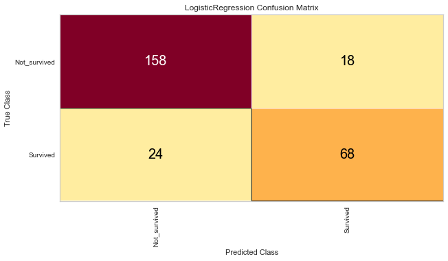
# The ConfusionMatrix visualizer taxes a model
classes = ['Not_survived','Survived']
cm = ConfusionMatrix(model, classes=classes, percent=False)
# Fit fits the passed model. This is unnecessary if you pass the visualizer a pre-fitted model
cm.fit(X_train, y_train)
# To create the ConfusionMatrix, we need some test data. Score runs predict() on the data
# and then creates the confusion_matrix from scikit learn.
cm.score(X_val, y_val)
# change fontsize of the labels in the figure
for label in cm.ax.texts:
label.set_size(20)
# How did we do?
cm.poof()
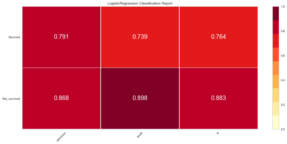
# Precision, Recall, and F1 Score
# set the size of the figure and the font size
#%matplotlib inline
plt.rcParams['figure.figsize'] = (15, 7)
plt.rcParams['font.size'] = 20
# Instantiate the visualizer
visualizer = ClassificationReport(model, classes=classes)
visualizer.fit(X_train, y_train) # Fit the training data to the visualizer
visualizer.score(X_val, y_val) # Evaluate the model on the test data
g = visualizer.poof()
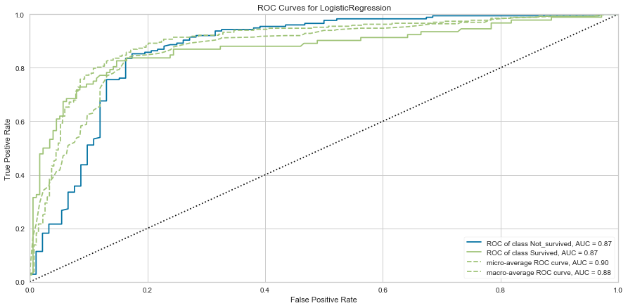
# ROC and AUC
#Instantiate the visualizer
visualizer = ROCAUC(model)
visualizer.fit(X_train, y_train) # Fit the training data to the visualizer
visualizer.score(X_val, y_val) # Evaluate the model on the test data
g = visualizer.poof()