
Airline Travel Safety Projects
For my full repository on this project, please refer to: Link
This Project was broken down into different sub-projects:
1. Dashboard Summary
2. Infographics
3. Blog Post
1. Dashboard Summary
For years, many news and media outlets try to exaggerate the dangers of air travel and flying. As we all know, air travel is the most convenient, if not, the most efficient option to travel from one part of the country to another part, or globally. There are many reasons why people use air travel. From families taking a vacation to business work related travel. Thus, it is essential to know that air travel is safe when they are thousands of feet off the ground. Media often times compare air travels against automobile and make it seem like that air travels is not any safer than automobile. In fact, we experience automobile accidents and fatalities every day, but when it comes to an airline accident and fatalities it really catch our attention. One main reason is due to the risk perception hyped by the media. Another part of the reasons is the scale and magnitude of an airplane incident; one airplane encompasses hundreds of lives; thus, one accident can cause a fatality of hundreds of lives. People often think automobile are safer than airline travels, due to the fact, that they are in control of their automobile whereas in air travel, safety and control is completely depended on the flight crew and captain.
Data Sources I used were:
- Airline Safety, Aviation Safety Network
- Crash Stats & Reports, NHTSA
- Annual Financial Results: U.S. Passenger Airlines, Airlines for America
- World Airlines Traffic and Capacity, Airlines for America
- Statistics, Bureau of Aircraft Accident Archives
-
ASN Aviation Safety Database, Aviation Safety Network
After the initial analysis was completed, the design methodology was established. I chose the color blue for my overall theme. This was selected for being a color that is easily identifiable by all (including those with various degrees of colorblindness).This color selection allows for people to easily follow any color changes in the visualizations as well as maintaining the clarity of the dashboard. I also chose red as the comparison color because it is easily distinguished from the color blue. Although for some visualization charts, like pie and stacked column, I had to rely on the usage of multiple colors to be able to distinguish between multiple variables. In choosing the visualization choices, it is important to have both familiarity and variety. In showing a variety of visualizations, it is help to thoroughly deliver the messages to the audience as well as showing different information and help keep readers engaged while not boring them with one type of chart over and over again.
When sharing this information with the internal team and executive leadership, a straightforward walkthrough of each chart explains the process and the findings at once. It is necessary to keep the explanation process short, but precise and thorough as executives may not have a lot of time on their hands.
Chart 1: Stacked column chart of the number of enplaned passengers by each major domestic airline carrier 1995-2018) – This shows that more and more passengers rely on air travel as airline safety and regulation get more stringent and safer. Two incidents affected travelers’ mentality were 2001 terrorist attack and 2008-2009, the Great Recession period, which we saw a decline in the numbers of seats taken by travelers during those times.
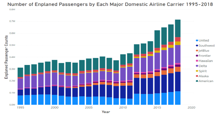 |
Chart 2: Pie chat of 2018 seats sold by major domestic airline carriers – The pie chart shows which domestic airline carriers had sold the most seats in 2018. From the visualizations, American, Delta, and Southwest airlines had sold the most seats in 2018 and followed by United. Alaskan and Hawaiian Airlines also sold a lot of seats in 2018 but did not see a lot of growth compared to the other major domestic airline carriers.
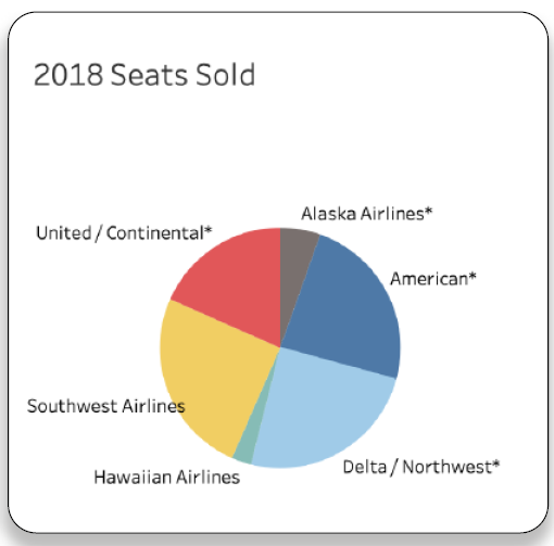
Chart 3: Bar chart of airline fatalities from 2000-2014 – This horizontal bar chart compare different airline carrier against each other for the numbers of fatalities each had from the period 2000 to 2014. All the US domestic airline carriers were highlighted in red for easy to distinguish. From a business strategy, it is good to understand how the competitors are performing both international and domestic carriers. Also, the data showed that most of US domestic airline carriers showed very low level of fatalities with American Airline being the exception.
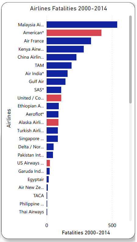
Chart 4: Line chart of air vs. Car fatalities per 100 million miles from 1995-2008 – This line chart compared the number of fatalities between airline and automobile. I used blue and red to easily distinguish the trend for both variables. It was important to maintain the same axis for both, so as to not show confusion. On average, we found that air travel fatalities per hundred million miles were 8.75 times lower than the corresponding value for car travel, although both showed decreasing trend from 1995 to 2008.
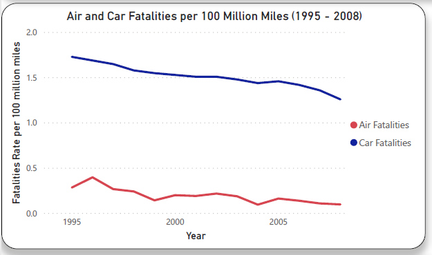
Chart 5: Line chart of airline fatalities over time (from 1942 – 2019) – This line chart shows the airline fatalities trend over the time period of 1942 to 2019.We can see there is a decreasing trend overall. This decreasing trend is due to the technology advancement in airlines in combination with more airline regulations being put in place for travelers’ safety.
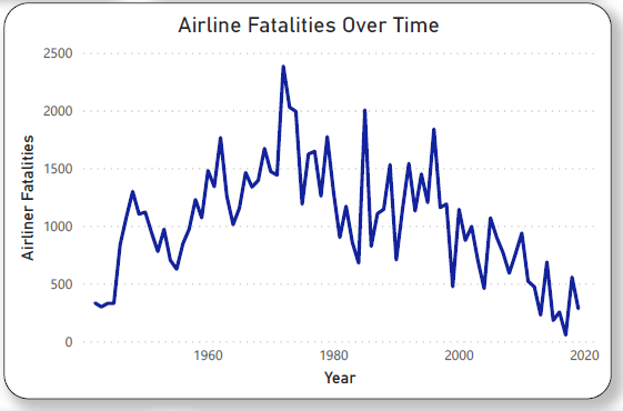
Chart 6: Heat map of airline accidents and fatalities by continent – This heat map shows the number of airline incidents and fatalities for each continent. Both Asia and Europe had the most accidents and fatalities due to it had more flights departed and arrived at these two continents. Of course, the volumes for South America and Africa are much lower so it did not experience that many accidents and fatalities compared to Asia and Europe. As for North America, it also did have some accidents and fatalities but not that many when compared against Asia, Europe and South America. Surprisingly, Central America had very little airline accidents and fatalities.
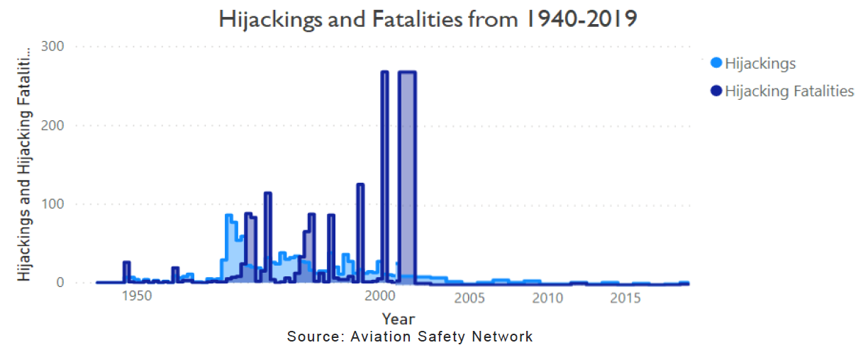
Chart 7: Bar chart of hijacking and fatalities from 1940-2019 – This bar chart shows a significant drop in hijackings and fatalities after the 9/11 terrorist attack in 2001. This is a graphic visualization showing just how much safer airline travel has become in addition to more airline regulations being put in place for travelers’ safety. Overall, from our findings, it is safe to echo the fact that air travel has become much safer in our present day and has been consistently safe especially after the 2001 Terrorist attack. These findings can support and amplify the confidence in air travel industry, when communicate with media and news presses.
2. Infographics
The infographic is intended for external audience. The idea is to project positive message about airlines safety and support that with data, while making it appealing and easily understandable for the public. The title of the infographic articulates what the graphics is all about – Air Travel Safety. I started with a blue and orange background and added an airplane picture to it as blue and orange seems to have a calming effect and also help audience to easily look at the infographic with such warm colors. I wanted the title to immediately state the point of the graphic, that airline travel is safe. Thus, the first point I made is that flying is safer than driving which is when what I did for the first metric. Comparing between automobile and airlines. This is important because we want the audience to compare between different modes of transportation when they want to go on vacations. When compared fatality rate side by side from 1995-2008 data, aviation is, on average, 8.75 times less than auto fatality rate per 100 million miles. The data source for this statistic is cited down in the reference section.
The next section for accident trends in air travel shows an impressive decrease of 53.7% over the last 10 years (2000-2008). A trend line is the easiest way to make this statistic easy to digest. I have used external data for this, and the data source is cited in the reference section.
The next metric shows the growth between 1995 and 2018 for the major domestic airline carriers. I want the audience to see that people are confident when it comes to flying and air travel. I wanted to point out to audience that there was an average of 386% increase in revenue for those airlines. The ones had that most growth, in terms of revenues, were Hawaiian and Southwest with 614% and 697% increase, respectively. United, Delta and American had 183%, 223% and 211% increase in revenue, respectively. This just show how much growth and passengers had rely on flying when compared a particular year in the past with a more recent year. The source data for this was included in the reference section.
The next metric is a pie chart showing an improvement in the number of fatal accidents when compared data from 1985-1999 to 2000-2014. I want the audience to know that there is a 9% reduction in the total number of fatal accidents. In addition, we experienced less incidents in the time period 2000-2014 when compared to the period 1985-1999. The data source is cited down in the reference section.
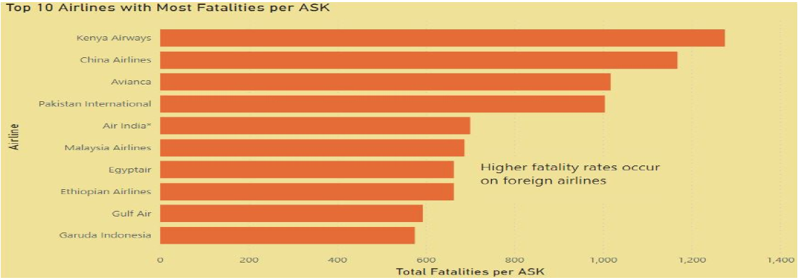
The next metric is a scatterplot chart showing the top 10 airlines that had the most fatalities per available seat kilometer. I want to emphasize to the audience that there is no US domestic airline carrier in the list of the top 10 showing most fatalities. Most of these airlines are in the developing countries with the exception of Air India and China Airline, where regulations and safety are not their top priority. This just support how much safer when we compared US airline carriers to their international competitors. The data source is included in the reference section.
The last metric and section stresses how safety is our number 1 priority and it is even more important after 2001 terrorist attack incident. There is a significant drop in the numbers of hijackings and hijacking fatalities after the 2001 period due to more regulations and safety being enforced to ensure travelers’ safety. I chose these main points and metrics because a passerby may only have a few seconds to glance at the graphic. I wanted them to catch the main points quickly. The charts are made for audience to easily interpret the data and support the main points I had written on the orange horizontal line. They can see that the graphs of the statistics support the claims being made. I wanted each point to stand out, so I used orange background to make it stand out from the blue background. And I kept the heading in white so it would stand out against the background.
References
- Accident Statistics. (n.d.). Accident Statistics. https://www.icao.int/safety/iStars/Pages/Accident-Statistics.aspx
- FiveThirtyEight Airline Safety Dataset. (2019, April 26). Kaggle. https://www.kaggle.com/fivethirtyeight/fivethirtyeight-airline-safety-dataset
- NHTSA. (2016). Traffic Safety Facts. Https://Crashstats.Nhtsa.Dot.Gov/Api/Public/ViewPublication/812580.
- Silver, N. (2017, April 21). Should Travelers Avoid Flying Airlines That Have Had Crashes in the Past? FiveThirtyEight. https://fivethirtyeight.com/features/should-travelers-avoid-flying-airlines-that-have-had-crashes-in-the-past/
3. Blog Post: Airline Travel - Is it safer than car?
Blog Post was created using Wix.com, please refer to this link for my blog post: Link
Why does airline catastrophes catch our attention?
We experience automobile accidents and fatalities every day, but when it comes to an airline accident and
fatalities it really catch our attention. What is the reason behind it? One main reason is due to the risk
perception hyped by the media. When we heard of airline accident, it induce fear and tend to give us false
impression that these events can occur no matter how infrequently they happen unlike automobile accidents.
The reason is that we tend to experience automobile accidents almost every day. Another part of the reasons
is the scale and magnitude of an airplane incident; one airplane contains hundreds of lives, thus, one
accident can cause a fatality of hundreds of lives. People often think automobile are safer than airline travels,
due to the fact, that they are in control of their automobile whereas in air travel, safety and control is
completely depended on the flight crew and captain.
For years, many news and media outlets try to exaggerate the dangers of air travel and flying. As we all know, air travel is the most convenient, if not, the most efficient option to travel from one part of the country to another part, or globally. There are many reasons why people use air travel. From families taking a vacation to business work related travel. Thus, it is essential to know that air travel is safe when they are thousands of feet off the ground. Media often times compare air travels against automobile and make it seem like that air travels is not any safer than automobile. But is it true?
 |
|---|
| Source: Aviation Safety Network and National Highway Traffic Safety Administration (NHTSA) |
For media outlets, yes, they would like us to think that air travel is not safer than automobile. They show charts that are manipulated and biased to make it seem like air travel incidences are worse than they appeared to be. So what is really the truth? Are air travels not as safe as people think they are? Are airlines no longer have strict regulation on passenger safety? Would we be better off driving or take other mode of transportation for vacation than travel by air? In order to determine whether it is safe or not and make a conclusion, we decided to do a few research and see if it is actually safer than automobile. As always, accidents can happen anywhere and at anytime no matter which modes of transportation you take. This include air travels, no matter how safe they are, there will always be a few accidents here and there. But, let’s compare it to auto accidents statistics from 1985 to 2014. During this time period, the number of automobile fatality accidents were 1,220,853 compared to the same period, with airline travel, it had roughly 3,055 fatality accidents. During 1985 to 2014 period, automobile had roughly 400 times more fatality incidents compared to air travel. This number of incidents averaged out to be 42000 for automobile to 324 airline travel incidents annually.
 |
|---|
| Source: Aviation Safety Network |
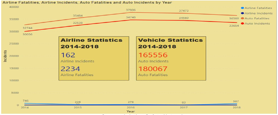
Let’s dive deeper in some more numbers from a five-year period, 2014 to 2018. During this period, the number of auto incidents was as much as 1,021 times over airline incidents (U.S. Department of Transportation, 2019). Glancing at the chart, some may say that car accidents usually involved fewer people than airline accidents. Is it possible that the small numbers of airline incidents can account for larger fatalities than auto fatalities? Let’s look at those chart again, we can see there is a huge difference between the number of airline fatalities and incidents compared to auto incidents and fatalities. To put in a different perspective, auto fatalities accounted 80 times more than airline fatalities during the period, 2014 to 2018. From these two statistics and graphs between the year 1985 - 2018, we can see that air travel still had lower fatalities and lower incidents compared to automobile. It seems like air travel is safer than automobile.
Does this mean airline travel is safe?
 |
|---|
| Source: Aviation Safety Network |
While we did see that airline fatalities and incidents were not as high as auto incidents and fatalities from 1985 to 2018, for some, they may still be skeptical about whether airline travel is actually safe or not. Let’s dive deeper into airline travels incidents and fatalities, when it comes to these numbers, they are accounted for all airlines. Thus, both international and domestic airlines are taken into account. Is it possible that one airline has higher fatality and incident rate than others?
Media outlets sometimes portrayed charts and graph showing how some airlines are less safe than others. This may not be entirely true, and these raw numbers can be misleading because some airline have more flights and longer flight path than others. In fact, an airline that has 10 flights per week with 5 accidents will have a higher accident rate than an airline that has 100 flights per week with 5 accidents in total. Hence, it is more precise to compare airlines fatalities by available seat kilometers flown to normalize both small and large airlines.
Once we break down the airlines fatalities by available seat kilometers flown, it is easier to see that domestic flights have much lower both fatalities and incidents compared to international flights. In fact, domestic airlines are not in the top 10 airlines with most fatalities per ASK, or available seat kilometer. Kenya Airways is the airline that has the most fatalities per available seat kilometer. Based on Flight Safety Foundation, Kenya Airways reported 2 fatal accidents and 283 fatalities throughout their flight record. When adjusted to per available seat kilometer, it is equal to 1,275 fatalities and 9 accidents per available seat kilometer (1996 - 2020). Based on this graph, we can see that domestic airlines are much safer than international airlines, especially in countries where airline regulations are not as stringent.
 |
|---|
| Source: Aviation Safety Network |
For us, flying has become much safer after the 2001 terrorist attacks. After 2001, United States has imposed many regulations and more aviation security to ensure the safety of its passengers. From the chart, we can see the number of aviation hijackings and hijacking fatalities have significantly dropped from 2001 onward. We can see huge differences before and after 2001 terrorist attack incidents from the chart and how aviation industry have changed dramatically. More security and more regulation imposed may mean longer wait times to board planes, but it also means the safety of our country’s travelers have increased.
Conclusion Aviation industry is always competitive and constantly evolving both to meet travelers’ demand and ensure the safety of their passengers. There have been numerous changes from when airplanes were first invented by the Wrights Brothers in 1903, and when Amelia Earhart first flew across the Atlantic Ocean in 1928 to today’s autopilot equipped airplanes, evolving cockpit safety technology, constant flight status monitoring, security check and passenger cabin safety measures. All of these features existed to provide a more enhanced and a safer travel for passengers. With all of these aspects in place, it is safe to say that air travel is safer than automobiles in today’s world. Why wait, book those plane tickets now, while price is still cheap, to your favorite destination this summer. Worry-free with our stringent airline safety measures and technology in place.
References
- Flight Safety Foundation. (1996-2020). Aviation Safety Network. Retrieved from Aviation Safety Network: https://aviation-safety.net/
- Peterson, B. (2016, October 5). How Airport Security Has Changed Since 9/11. Retrieved from https://www.cntraveler.com/story/how-airport7/security-has-changed-since-september-11
- Seaney, R. (2019, December 19). 9 Ways Airport Security Changed Since 9/11. Retrieved from Fare Compare: https://www.farecompare.com/traveladvice/9-ways-security-has-changed-since-911/
- U.S. Department of Transportation. (2019, November 26). National Highway Traffic Safety Administration. Retrieved from National Highway Traffic Safety Administration: https://cdan.dot.gov/query